If you have been following In the Folds for a while, you will know that we LOVE a panel line. It’s one of the things that make our patterns recognisable and uniquely ‘In the Folds’.
Recently someone in our community said they were curious to know how we decide where to put style lines like the ones in the Lindon top and I thought it would be a great question to answer in this week’s Behind the Scenes email.
how i learned to design garments
Early on in my university degree, we learned a new way to design garments. We would take an existing garment and drape it on a mannequin. We could turn it upside down, back-to-front, to the side, whatever we wanted, and then pinned and folded the garment until we were happy with the design. We would then draft a pattern from that concept.
This way of designing and drafting has been one I have been coming back to over and over throughout the years. Not only am I not a great drawer, I am also not great at coming up with an idea and then formulating it into a design. What informs my designs is experimenting with shapes in a physical way, and being able to drape garments on a mannequin has always been a great way for me to generate interesting shapes and ideas.
Which brings us to the Lindon top.
the lindon top design process
I started out thinking that I’d like to design a fairly simple top. Something that would be a nice first project for the year for our community (as the January issue of Curated is normally centred around planning projects in some way), but something that would still get people excited.
For some reason I thought of a very old dress I have stashed away in my wardrobe. (Well, actually in a box in the top of my wardrobe waiting to be overdyed (for the second time) because it is so faded and well-loved it can no longer be worn!) This dress has a really interesting shape. It’s made from two different fabrics, has a round seam through the middle, and can be worn in multiple ways. I put the dress on and started playing with different shapes. I pulled one side forward and held it in place. Because of the two different fabrics, the panel line wrapping around the side really stood out and something about that panel seam wrapping around the body was enough to get me started.
Now that I use CLO3D to help me with my initial drafts, I was able to jump straight into it and start playing. I used the Marden shirt design as a base and started experimenting with the idea of a panel wrapping around the body.
Here is the initial draft. The different colours is how the program highlights the different pattern pieces, which is a handy function for designs like mine that have a lot of panel lines. The two parts to the wrap panel was inspired by the dress I was playing with, but after seeing it here I realised it didn’t need it and it was just overcomplicating things.
For the next take I removed the additional panel and made things more geometric. I also started playing with the idea of an asymmetric hem shape. As you can see, this is when it starts looking like Lindon. I then increased the amount of gathers in the upper section.
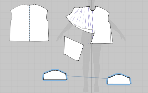
For those of you who like to geek out about pattern making, you might find this interesting. The purple broken lines on the FRONT show where the piece was slashed and spread to create additional volume.
In this image you can see the FRONT pattern piece for the first draft (left) and the FRONT pattern piece for the second draft (right) and the difference in volume added. This difference changes the amount of gathering in the seam that joins to the lower panel. This was a part of the design that took a lot of fine-tuning when it made it out of the digital realm.
At this stage, although the panel line was becoming the main event of the top, I actually hadn’t thought too much about the placement. I started to think about whether it would work better lower on the body. Here you can see it lower (left) and where it was in the previous version (right).
Looking back at my workflow, I can see that for some reason I chose the lower panel line at this point! For those of you who have seen the final pattern, you will know it ended up moving a lot higher, but I didn’t figure that out until I started the physical sampling process.
The plan had always been to create a pattern for a woven top. Wovens are my preferred fabric to work with and design for and what I have the most experience with. But, at this point I realised the top would look great in a knit. I added a neckband in CLO to visualise what it would look like as a t-shirt and realised this could be a pretty interesting alternate view to add to the pattern.
It was at this stage that I had gone as far as I could go in the digital realm and needed to see the pattern made up in fabric. I exported the pattern from CLO and printed it so I could make it in calico. Although I knew the final pattern would need to be made from something much lighter than calico (due to its shape and the gathers), calico helps me see any issues in the pattern that sometimes can hide or not seem like such a big deal in a lighter / more drapey fabric.
Excuse these photos!
I was not planning on publishing them on the internet. I often try on my samples throughout the sampling process so I can get a sense of how they feel and work on the body. I take these photos for my own reference, as often what I see in a photo in comparison to what I notice in the mirror is different.
As you can see, in the first sample the panel line is very low. I didn’t mind it (and still don’t), but when imagining what our community would want, I felt like a seam line in this position wouldn’t be for everyone. Normally panel lines are placed in a garment to add some shaping or add some interest, and a seam placed in this position feels like a bit of an afterthought… like it’s not there for a reason.
I started playing with the idea of raising the panel line so it was closer to the bust. You can see how I did this by folding out a large wedge and pinning it. This is a quick way to be able to visualise what a change like this would look like before actually making the change to the pattern.
I then made the alteration to the pattern, along with a number of other things, including the front panel to the back pattern piece. As you can see in this sample, the panel line is not sitting smoothly and needs some refinement, and the angle of the vertical seam is too extreme. The pin on the toile shows where I moved it to.
If I had known I was going to write this blog post I would have taken more photos of the sampling process, as there were a few more iterations between these versions, but unfortunately this is all I have.
So I guess, to answer the question of how I place panel lines on a garment, I have to say that it’s a process of experimentation and exploring different ways seam lines can work on the body. I do this digitally at first to quickly experiment with a wide range of options, and then do it the old fashioned way of cutting and sewing and then draping on the body.
As you can see, the design process (for me at least!) really is a combination of inspiration and trial and error. I hope you’ve enjoyed this peek behind the curtain of my creative process. If you have any questions about it, I’d love to hear them. It might even inspire our next blog post!
WHAT YOU’VE BEEN MAKING…
Rennie dress made by Curated member, Morag.
Ormond chore coat made by Curated member, Stephanie.


